Saturday, July 1, 2017

May 2017

Exploring Monoline Lettering to Folded Pen Lettering
with Yukimi Annand

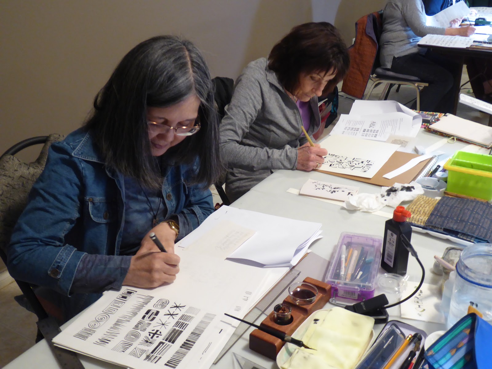
The workshop was two years in planning and anticipating! We were more than excited to welcome Yukimi Annand. Many of us have had other workshops with her, but this was a first for our home guild.  We were using the new Horizon nib and sumi ink for the first day, graduating to acrylic coloured inks on the second day.

Many participants were new to the folded pen and the exercises we were given, helped familiarize us with the types of marks that can be made with the nib. Our next step was to make letters and then 'invent' letters that portrayed the feeling of our chosen quote. We needed to come up with a full alphabet in order to write our words. 

We worked on Strathmore 300 or 400 drawing paper and then Arches MBM for our good paper. It is sad to think that MBM is no longer going to be imported into the North American market. 

By late afternoon on Sunday, our heads were full of possibilities! 


May 2017

Monoline Lettering using a Speedball B nib

After taking a class with Coral Pearl from Portland, OR, Shannon shared some of the techniques the participants learned. Based on the Charles Rennie MacIntosh style typeface, Bungalow, and using a Speedball B nib, we went through the alphabet, lettering at about ½" high. We touched on spacing, proportions and developing a rhythm. Plant, pressure and pause factored into the way to use the nib. 

Interesting to note, Cora has been lettering since before she was a teenager. She has studied with some of the best instructors. Should your paths cross at a conference in the future, you might want to sign on for a class with her. Cora has a lot to offer! 

The B nibs were not a "go to" tool for me and I did prefer the French Blanzy Treraid nibs I inherited from Stan Jones. I just might be tempted to use them more often! 


Monday, June 12, 2017

April 2017

Geometric Lettering

This program was a revisit from long ago, given to us by Diana Haines after one of her trip to England and a study session at West Dean College with Martin Wenham. This was an alphabet adapted from a design by Hans Schmidt. 

Diana loved to have her family visits coincide with courses given at West Dean College and she studied several times with Martin Wenham. 

Based on geometric shapes, a circle, half circle, a triangle and rectangle, the letters fit into a square. 
Once you get the 'feel' of them, they can be decorated with coloured pencil, watercolour, markers or zen tangling type designs, etc. 

We first looked at this in the Fall of 1994! Nan led us through the April program this time around and gave us homework to do!


February 2017

Coloured Pencil

Working with instructions from a workshop many years ago with Benny McAdams, we worked on VALUE REVERSAL with Prismacolour coloured pencils. Nan did her March postcard for me, using this technique.
 
January 2017

In Between the Lines - Valentines.

Violet led us through the program to make Valentine's. Draw the horizontal lines first and letter in between them. Add colour, decorate and give them with love!